
Chromatic grays. What are they?

Chromatic grays are the perfect way to use bold color
without having it look garish.
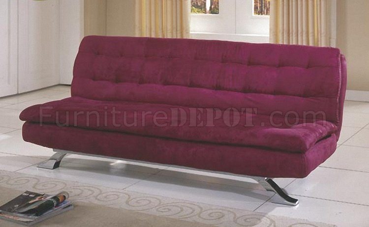
For example, the mustard chair above from Anthropologie.
It may look great in lemon yellow, but it just might begin to irritate you after a while.
Chromatic: adj. - Pertaining to color.
Gray: adj. - of a color between black and white; having a neutral hue.
Literally, it is a grayed-down color.
But grayed-down does NOT mean dull or boring!
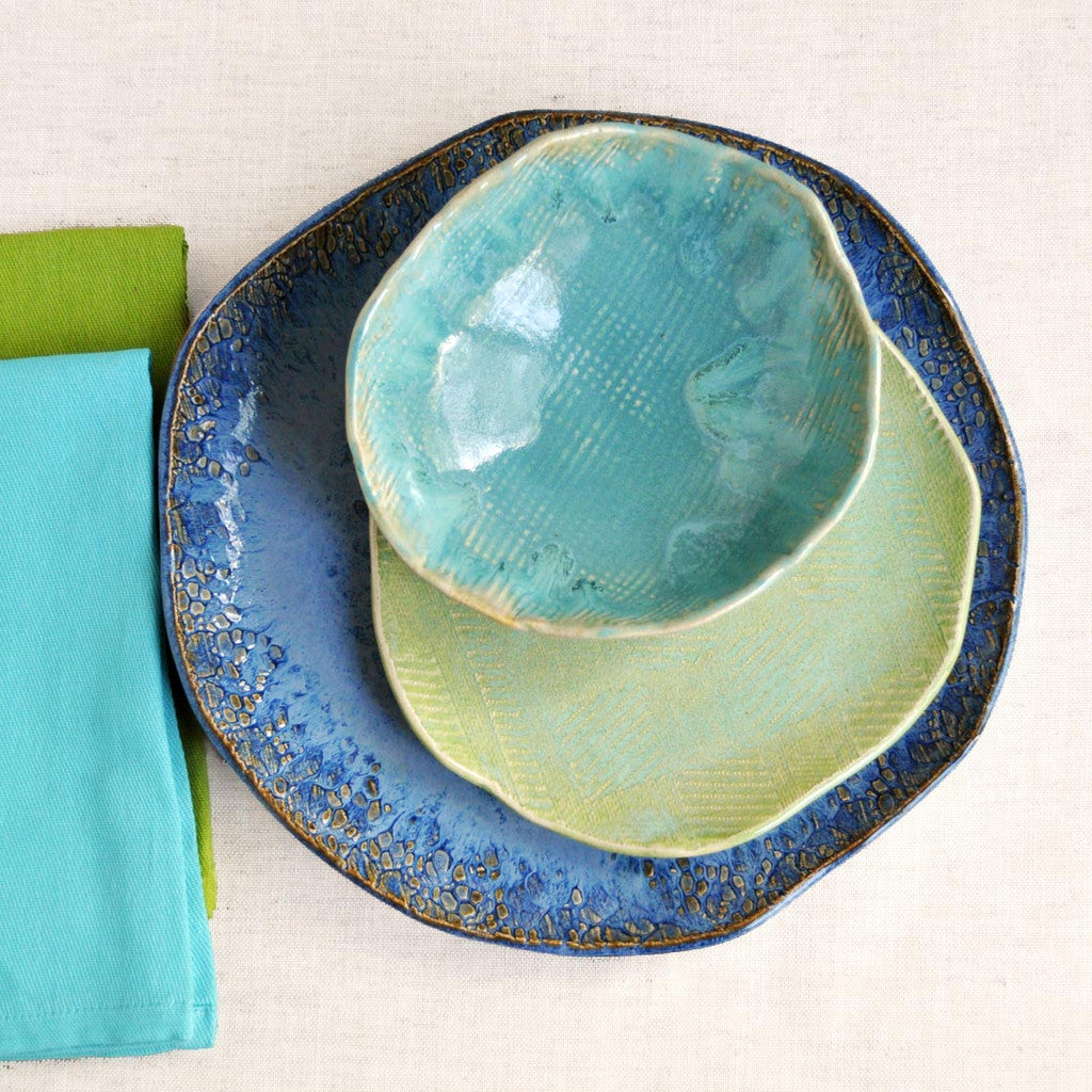
Take a look at the lovely ceramic serving pieces above...
and the art below!

Chromatic grays can be bold, deep, dramatic and rich...

or they can be pale and ethereal, like this painting...

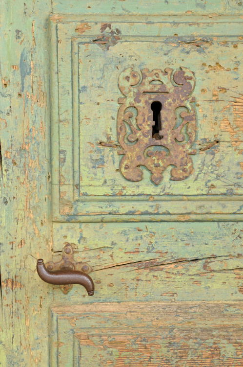
or this antique door...
They can also be a mix of darks and lights like this beautiful painting...

They can either be modern...

or they can be traditional.

How do you pick a pleasing palette of chromatic grays?
It is not difficult. There is a foolproof method:
- Find a fabric sample or item that you love.
- Take it to a paint store or anywhere you find swatches.
- Choose a variety of paint swatches in your colors.
- Start matching. Is it too bright? To dark or light? Take away colors that don't match.
Why do we like chromatic grays?
It's not just because they are "tastefully restrained."
There is a scientific and physiological reason:
Chromatic grays are easy on the eyes. Literally.
Bright, saturated (not grayed at all) colors are almost jarring to behold. They're exciting for short periods of time!
But, our eyes/brains need to "rest" from them; to compensate for them by optically creating a complementary color.
Try this:
Stare at a bright orange or yellow object for a few minutes.
Now, look at a white wall. What do you see?
Most likely, a blue or purple image - a complementary color. It is your brain's way of mellowing out the intense color.
Many of us are in a current love affair with all white, gray or taupe monochromatic rooms. They are serene, but some times you just need a pop of COLOR!
Chromatic grays are the safest way to use bold color.
Close value chromatic grays are practically foolproof!
(Close value just means colors are the same degree of light or dark; for example, pastels, dark jewel tones, medium tones, etc.)
Let me know if you have any questions!
Word for the Day:
“You shall make a screen for the entrance of the tent, of blue and purple and scarlet yarns and fine twined linen, embroidered with needlework.
6 comments:
Interesting...it totally makes sense! I'd never thought about it before, but now I know why I like certain colors, I thought it was just because I was a 'cool' color person.
Very interesting. So does every color have a gray counter part?
I agree I love these colors.They are a wonderful neutral color too.
((((Hugs))))
Anne
Ok, I've heard people speak about chromatic grays but I never understood the full impact. Thanks for sharing!
Thank you for answering my question the other day through this post. I knew it! I just needed a color expert to verify my gray theory. Are you available to tag along on a trip to the store? I am in need of some color help in person on the spot. :) Love the pics you chose!
Liz
Thanks Revi for sharing this fun information. It always amazes me at what adding a shade of grey can do to a color. Thanks for sharing it with Share Your Cup I really enjoyed learning.
Hugs,
Jann
Post a Comment