Friday, November 7, 2014

Seven Things to Do With Antlers...


If you have a neutral room, or home, you probably love adding textural elements to the mix.

I certainly do! One of my favorite pieces to use has been a set of deer antlers a friend gave me years ago. Mine are somewhat unusual, as they have the hide and hair wrapped around a wooden form. In the photo above, you can see how I placed them inside an antique picture frame. I usually prefer them in a mostly symmetrical arrangement in a gallery wall, after all, they are symmetrical!

While antlers have been a popular trend the past few years, they have long been a classic element in traditional homes. 

Here are seven antler decor ideas that caught my eye recently:

#1
Antlers above a window 
These are in a very traditional kitchen. 
SOOO Downton Abbey! 


#2
Antlers above a door.
In this case it happens to be a pantry door. 
Notice, these have been given a creative paint treatment.


#3
Antlers in a bell jar.

Antlers in a cloche by Camille Price @Loren Carline | get will to save us some!

via Christy Ford for And George

#4
Antlers on top of an Armoire or Cabinet.


#5
Antlers in a table scape.
Don't you love the contrast of the sparkly mercury glass?


#6
Antlers as Table Base. 
These are ANTLERS, and they're still available on Etsy.

naturally shed deer antler & round glass coffee table

via benjaminbydesign on Etsy.

#7
Antlers as Christmas Decor!

Faux Antler Wreath

Unfortunately, this Pottery Barn version is no longer available.

However, below, 
The Country Chic Cottage has a tutorial for a knock-off design, making faux antlers.

faux antler wreath from the pottery barn

I might have to try a similar version, using some of my collected antlers!
If you're looking for antlers, check my Etsy shop next week. 

Word for the Day:
Psalm 42:1 
As the deer pants for the water brooks, so my soul pants after you, God.


Word for the Day:
Psalm 103:1
Bless the Lord, O my soul, and all that is within me, bless his holy name!

Possibly Linking With:
Sunday
Sundays at Home
Sunday’s Best
Nifty Thrifty Sunday
Monday
Mod Mix Monday
Make it Pretty Monday
Amaze Me Monday
Make it Monday
Tuesday
Nifty Thrifty Tuesday
The Scoop
Wednesday
Wow Us Wednesday
What’s it Wednesday
Vintage Inspiration Party
Cottage Style Party
Outside the Box Link Party
Thursday
Under $100 Link Party
Treasure Hunt Thursday
Share Your Cup Thursday
Friday
Feathered Nest Friday
Furniture Feature Friday
Frugal Friday
Junkin’ Joe
Thrifty Things Friday
Saturday
Party Junk


Sunday, October 26, 2014

Color Theory 101 - How to use Color Successfully - Tutorial #2 - Analogous and Complementary Color

Great display of McCoy collection
Light-value, analogous color used successfully.
Image found via Pinterest, original source not found. 
Please contact me if you know the source.

In Tutorial #1, we looked at pure color, the full spectrum of primary, secondary and tertiary colors.

While we may LOVE those pure, intense colors, they are rarely colors used in our home decor, and they probably are not really considered our "basic" wardrobe pieces. Why? A few reasons...

Pure, rich, intense color is beautiful...but not restful. It is exciting, inspiring, and we love it! In small doses. 

Look outside in nature...rocks, dirt, grass, trees and sky...they are either "neutral" grayed down colors or soft, light versions of pure, intense, saturated, color wheel color. 

Neutrals like gray, brown, black and white are easy on the eye...literally.

Complementary colors used successfully - red and green
via apartment therapy

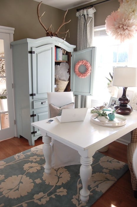
The apartment above uses some intense color, but notice the walls, floors, and even some of the furniture are neutral. The most intense color is the rug under the coffee table. If the entire floor were carpeted, it would be too much! As it is now, the use of color is very successful and dramatic. This is a great example of using complementary color well!

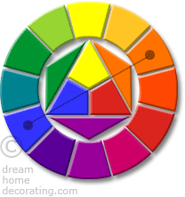
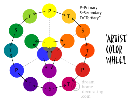
The colors used in this room are red and green. Notice on the color wheel below, red and green are opposite each other on the color wheel, which makes them complementary. 

3-primary color wheel chart with complementary colors

Blue and orange, yellow and violet, red violet and yellow green are all complementary colors, as are others in the color wheel above.

While the red rug in the room above is color wheel red, imagine if the designer had chosen the intense green on the color wheel instead of the soft chartreuse version of green! It would not have been an easy room in which to relax or entertain. The damask velvet upholstery has a brown background, and the coordinating stripe on the chairs has brown, red and soft chartreuse.

Color Theory and Gestalt

In a nutshell, Gestalt is a set of principles arrived at by a group of German psychologists in the 1920’s. They attempted to describe how humans perceive and organize visual elements into groups of "unified wholes" by using a set of principles. Gestalt is about order - it is the opposite of chaos.

We are designed to prefer order, relationship and completion.
Our eyes prefer to see grayed down color and neutrals. Intense, saturated color in large amounts is jarring, and even hard to continue to look at for long periods of time. 

Purple & Yellow  complementary
Complementary colors - yellow and violet
via Pinterest: Shutterstock Copyright: Copyright MTV Oyj 2010/ Shutterstock.

Complementary Colors and Simultaneous Contrast

Complementary colors, those directly across from each other on the color wheel, are the most visually intense colors to view together. 

There is an optical effect called simultaneous contrast that occurs when intense, saturated colors are positioned touching or overlapping each other.

They will appear to "vibrate" or "jump" when we try to look at them for more than a few seconds. 

Our eyes and our brains work together to compensate for this physiological effect! If you have intense violet and intense yellow next to each other, and you stare at them for a few minutes, your eyes will actually create a turquoise line between them! 

When you KNOW about this visual effect, you can use it to your advantage! Intense opposing color in small amounts can bring just the right "pop" to a composition.

That green couch is gorgeous. The purple cushions and orange flowers really set it off.
Close-complementary colors - yellow green and red orange

The red-orange flowers against the green-yellow sofa are a nice "pop" of color. Once again, notice the amounts of saturated color in this room - white walls, wood floor, with a patterned rug and bright sofa being "toned down" by dark furniture and art pieces.

The colors above are actually analogous close-complements. This means it is one of the opposite colors, within a close-range of analogous colors.

Analagous colors are colors that are next to each other on the color wheel.  


Red

Red
Orange

Orange
Yellow Orange

Yellow
Yellow
Green

Green
Blue Green

Blue
Blue Violet
Violet
Red
Violet


While using complementary colors successfully can be a bit tricky, using analogous colors is relatively fool-proof! Choose any color above, and the colors flanking it within a few hues on either side of it are analogous colors. 

analogous colors
Analogous colors - yellow green, green, blue green, blue
via Pinterest from Colors of Life

Analogous
Analogous Colors - orange, red orange, red, red violet
via Pinterest - Long Island Prep

violet and blue
Analogous colors - red violet, violet, blue violet, blue, blue green
via Pinterest - from revbyrd

If you love bright colors, and want to use them in a room or an outfit, choosing a set of analogous colors is about the safest way to use intense color successfully.

skulls
Successful use of bright colors!

These handmade felt skulls are a lovely example of using bright colors successfully! Most are secondary and tertiary colors, and there are a few neutrals in some. 

If you crave intense color, find a textile you love, and carry a swatch with you. "Match" colors with your swatch. Keep in mind, use complementary colors in small doses for maximum success. 

Another way to ensure success is by using close-value colors. Color value is simply how light or dark a color is. Most people do this instinctively - using pastels together, brights together, primary colors together, and deep tones together. 

Beach Cottage handmade dinnerware from Lee Wolfe Pottery  - Analogous colors
Close value analogous colors

It is possible to mix palettes, but it can be tricky if you don't know the "rules" yet. You're learning the rules NOW! 

Review of best ways to use bright color successfully:

  • Use primary red, yellow and blue together...with lots of white!
  • Use secondary and tertiary colors together as analogous colors.
  • Add complementary colors as an accent - a small amount.
Value - the lightness or darkness a color. Hue is also about value. Think about a paint swatch with colors ranging from lighter to darker.

Analogous - next to or beside on the color wheel. It may be 2 - 6 colors, as long as they're positioned nearby and not across.

Complementary - opposite on the color wheel

Close Complement - opposite analogous colors on the color wheel.

Close value - close in the lightness or darkness - such as pastels.

Saturated - intense, pure, color wheel color - not lightened, darkened or mixed with gray.

Word for the Day:
Isaiah 62:1
For Zion's sake I will not keep silent, and for Jerusalem's sake I will not be quiet, until her righteousness goes forth as brightness, and her salvation as a burning torch.


Saturday, October 18, 2014

COLOR THEORY 101 - How to use color well - Tutorial #1

COLOR...We are surrounded by it every minute of every day. 

We know which colors make us happy...and which do not. 

We know which colors we're wearing when someone tells us, "You look great in that!"
And we know the outfits we'd LIKE to love, but we don't feel good in them.

grayish


Color evokes emotional and physical responses. We associate it with people, memories, places...

Though we know what we love when we see it...many of us have trouble knowing how to use color properly in certain applications.

Beautiful, saturated blue.

Via Pinterest - Kissing Under Spiderwebs

For example, my very favorite color in the world is magenta, or red violet. 
I could eat that color with a spoon. Every flower I want to choose is some shade of magenta.

red violet
Image found on Pinterest from Tumblr - no source found.
Please contact me to add credit for this photo.


But, I will not paint the outside of my home magenta. Or even a small room. And I probably won't buy a winter coat in that color. 

On the other hand, a front door...a scarf...a throw...might be just perfect in magenta. 


Color can be soothing or exciting!

!

How do we use color successfully in our everyday lives? 

How can we wear our favorite colors without looking like we just escaped from prison or the circus has come to town?
How can we use them in our homes without getting nasty letters from the neighborhood association?

wow!
Image found on Pinterest from Tumblr - no source found.
Please contact me to add credit for this photo.

You CAN use color intentionally and successfully. Color does not have to be intimidating. Within a short time, you can be a color maven!

via  pinterest from danheller.com

This is the first in a series of posts in which I will share information about color.* 

In subsequent posts, we will explore color in greater detail; each post will build upon the information learned in the last post. 

You will gain a better understanding of color and ways you can 
achieve the results you desire using the colors you prefer!

Color is NOT rocket science, but there is some very interesting physics involved.

The best way to begin is to assume you have no knowledge of color. (Please bear with me if you already know this. Consider it a refresher course!)


First things first: 

COLOR CANNOT EXIST WITHOUT LIGHT.

Light contains all color - a full spectrum.

Dictionary.com defines spectrum as: an array of entities, as light waves or particles, ordered in accordance with the magnitudes of a common physical property, as wavelength or mass: often the band of colors produced when sunlight is passed through a prism, comprising red, orange, yellow,green, blue, indigo, and violet.

More simply, a spectrum is all visible colors in a specific order.

You have seen a spectrum in a rainbow...


...and maybe you remember with a prism back in junior high school science class...

dispersion of white light

image via tutorvista.com

There is a handy acronym to help remember the visible spectrum order:

Roy G. Biv 


Red


Orange

Yellow

Green

Blue

Indigo
(blue violet)

Violet

There are also invisible colors in a spectrum - infra-red, which is ordered before red, 
and ultra-violet, which is ordered after violet in the spectrum.

Of the Roy G. Biv colors, there are three PRIMARY COLORS; Red, Yellow and Blue.

Primary colors are the basic colors from which all other colors may be mixed. 
We cannot mix any colors to get red, yellow or blue. They are our starting-point colors.
Using light, red, yellow and blue can combine to make all the spectrum. 
(NOTE: This can be a bit difficult with paint pigments!)

This color wheel illustrates the order of the spectrum:

3-primary color wheel chart with complementary colors

Notice the placement and relationships between the primary colors to each other on the color wheel. They form a triangle. They are equidistant to each other. 

If red, yellow and blue are primary colors, then mixing them together in equal amounts will theoretically give us the secondary colors; orange, green and violet. The secondary colors are also equidistant to each other.

If we mix equal amounts of the secondary colors, we get even more colors - the tertiary colors. 

The tertiary colors include red orange, yellow orange, yellow green, blue green, blue violet, and red violet


Red

Red
Orange

Orange
Yellow Orange

Yellow
Yellow
Green

Green
Blue Green

Blue
Blue Violet
Violet
Red
Violet

artist color mixing chart with secondary and tertiary colors

The colors on the color wheels above are also called pure colors, or saturated colors

(SIDE NOTE: Most of the colors we use in everyday life are not pure, saturated colors, but grayed down, darkened or lightened versions of them.)

In addition to the primary, secondary and tertiary colors, the color wheel is divided into two equal segments; warm colors and cool colors.

Warm colors: 
All the colors that fall between red and yellow

analogous warm
Cool colors:
All the colors that fall between green and violet

analogous colors

via Pinterest bouldaslove.tumblr.com

NOTE: Red-violet and yellow-green can be perceived as either warm or cool.

If you have not yet noticed...
color is very orderly and balanced!

If you love order, balance, and everything in its place, this tutorial has probably been very easy for you to understand. If you're a bit more serendipitous, don't worry. Color has all kinds of fun surprises, and you will learn to use it intentionally in your designs. Though there is order, there is plenty of room for creativity, fun, and the unexpected. 

Knowing "the rules" will help you create harmony in your color schemes. 

Knowing when to break the rules can result in very dramatic results!

Next time, we will discuss:
  • Complementary colors
  • Analogous colors
  • Color terminology

We will define some basic "buzz words" to help us understand color better.

*Note: This is an updated revision of a series of posts I did way back when...probably 12 people read them. 

Words for the Day:

John 1:5
This is the message we have heard from him and proclaim to you, that God is light, and in him is no darkness at all.


Genesis 9:16
Whenever the rainbow appears in the clouds, I will see it and remember the everlasting covenant between God and all living creatures of every kind on the earth.

Possibly Linking With:
Sunday
Sundays at Home
Sunday’s Best
Nifty Thrifty Sunday
Monday
Mod Mix Monday
Make it Pretty Monday
Amaze Me Monday
Make it Monday
Tuesday
Nifty Thrifty Tuesday
The Scoop
Wednesday
Wow Us Wednesday
What’s it Wednesday
Vintage Inspiration Party
Cottage Style Party
Outside the Box Link Party
Thursday
Under $100 Link Party
Treasure Hunt Thursday
Share Your Cup Thursday
Friday
Feathered Nest Friday
Furniture Feature Friday
Frugal Friday
Junkin’ Joe
Thrifty Things Friday
Saturday
Party Junk