COLOR...We are surrounded by it every minute of every day.

via Country Living
We know which colors make us happy...and which do not.
We know which colors we're wearing when someone tells us, "You look great in that!"
And we know the outfits we'd LIKE to love, but we don't feel good in them.

via bodieandfou.com
Color evokes emotional and physical responses. We associate it with people, memories, places...
Though we know what we love when we see it...many of us have trouble knowing how to use color properly in certain applications.

Via Pinterest - Kissing Under Spiderwebs
For example, my very favorite color in the world is magenta, or red violet.
I could eat that color with a spoon. Every flower I want to choose is some shade of magenta.

Please contact me to add credit for this photo.
But, I will not paint the outside of my home magenta. Or even a small room. And I probably won't buy a winter coat in that color.
On the other hand, a front door...a scarf...a throw...might be just perfect in magenta.

via Revisionary Life
Color can be soothing or exciting!

via ThatBohemianGirl
How do we use color successfully in our everyday lives?
How can we wear our favorite colors without looking like we just escaped from prison or the circus has come to town?

via Shear Illusions
How can we use them in our homes without getting nasty letters from the neighborhood association?

Image found on Pinterest from Tumblr - no source found.
Please contact me to add credit for this photo.
You CAN use color intentionally and successfully. Color does not have to be intimidating. Within a short time, you can be a color maven!

via pinterest from danheller.com
This is the first in a series of posts in which I will share information about color.*
In subsequent posts, we will explore color in greater detail; each post will build upon the information learned in the last post.
You will gain a better understanding of color and ways you can
achieve the results you desire using the colors you prefer!
Color is NOT rocket science, but there is some very interesting physics involved.
The best way to begin is to assume you have no knowledge of color. (Please bear with me if you already know this. Consider it a refresher course!)

First things first:
COLOR CANNOT EXIST WITHOUT LIGHT.
Light contains all color - a full spectrum.
More simply, a spectrum is all visible colors in a specific order.
You have seen a spectrum in a rainbow...
...and maybe you remember with a prism back in junior high school science class...

Roy G. Biv
Red
|
Orange
|
Yellow
|
Green
|
Blue
|
Indigo
(blue violet)
|
Violet
|
There are also invisible colors in a spectrum - infra-red, which is ordered before red,
and ultra-violet, which is ordered after violet in the spectrum.
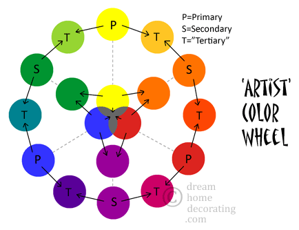
Of the Roy G. Biv colors, there are three PRIMARY COLORS; Red, Yellow and Blue.
Primary colors are the basic colors from which all other colors may be mixed.
We cannot mix any colors to get red, yellow or blue. They are our starting-point colors.
Using light, red, yellow and blue can combine to make all the spectrum.
(NOTE: This can be a bit difficult with paint pigments!)
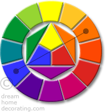
This color wheel illustrates the order of the spectrum:

Notice the placement and relationships between the primary colors to each other on the color wheel. They form a triangle. They are equidistant to each other.
If red, yellow and blue are primary colors, then mixing them together in equal amounts will theoretically give us the secondary colors; orange, green and violet. The secondary colors are also equidistant to each other.
If we mix equal amounts of the secondary colors, we get even more colors - the tertiary colors.
The tertiary colors include red orange, yellow orange, yellow green, blue green, blue violet, and red violet
Red
|
Red
Orange
|
Orange
|
Yellow Orange
|
Yellow
|
Yellow
Green
|
Green
|
Blue Green
|
Blue
|
Blue Violet
|
Violet
|
Red
Violet
|

The colors on the color wheels above are also called pure colors, or saturated colors.
(SIDE NOTE: Most of the colors we use in everyday life are not pure, saturated colors, but grayed down, darkened or lightened versions of them.)
In addition to the primary, secondary and tertiary colors, the color wheel is divided into two equal segments; warm colors and cool colors.
Warm colors:
All the colors that fall between red and yellow

Cool colors:
All the colors that fall between green and violet

via Pinterest bouldaslove.tumblr.com
NOTE: Red-violet and yellow-green can be perceived as either warm or cool.
If you have not yet noticed...
color is very orderly and balanced!
If you love order, balance, and everything in its place, this tutorial has probably been very easy for you to understand. If you're a bit more serendipitous, don't worry. Color has all kinds of fun surprises, and you will learn to use it intentionally in your designs. Though there is order, there is plenty of room for creativity, fun, and the unexpected.
Knowing "the rules" will help you create harmony in your color schemes.
Knowing when to break the rules can result in very dramatic results!
Next time, we will discuss:
- Complementary colors
- Analogous colors
- Color terminology
We will define some basic "buzz words" to help us understand color better.
*Note: This is an updated revision of a series of posts I did way back when...probably 12 people read them.
Words for the Day:
This is the message we have heard from him and proclaim to you, that God is light, and in him is no darkness at all.
Genesis 9:16
Whenever the rainbow appears in the clouds, I will see it and remember the everlasting covenant between God and all living creatures of every kind on the earth.
Whenever the rainbow appears in the clouds, I will see it and remember the everlasting covenant between God and all living creatures of every kind on the earth.
Possibly Linking With:
| |
Sunday
| |
Sundays at Home
| |
Sunday’s Best
| |
Nifty Thrifty Sunday
| |
Monday
| |
Mod Mix Monday
| |
Make it Pretty Monday
| |
Amaze Me Monday
| |
Make it Monday
| |
Tuesday
| |
Nifty Thrifty Tuesday
| |
The Scoop
| |
Wednesday
| |
Wow Us Wednesday
| |
What’s it Wednesday
| |
Vintage Inspiration Party
| |
Vintage Inspiration Party
| |
Vintage Inspiration Party
| |
Cottage Style Party
| |
Outside the Box Link Party
| |
Thursday
| |
Under $100 Link Party
| |
Treasure Hunt Thursday
| |
Share Your Cup Thursday
| |
Friday
| |
Feathered Nest Friday
| |
Furniture Feature Friday
| |
Frugal Friday
| |
Junkin’ Joe
| |
Thrifty Things Friday
| |
Saturday
| |
Party Junk
|

9 comments:
Very interesting.. I did learn a few new things.. excited to read next post... Thanks for sharing.. Blessings
Hi, Revi!
Happy Weekend!! I am back from Maine, and the colors there were incredible. Wow, you've done a lot of research on this topic - very impressive. I mostly use neutrals with accents of greens, blues, yellows, etc. More pops of colors. This is also how I like to garden.
Look forward to your next installment.
Take care,
L
Color for me! Very informative and concise at the basics of color. I tend toward the cooler colors with a dash of hot ones.
Yes, I love organization, and yes, I loved and followed this post easily. Looking forward to the follow ups.
(ps I purchased a magenta, full-length wool coat 30 yrs and still wear it! It has a timeless cut and I feel good every time I wear it.)
Rita
WOW Revi ... that's some interesting, colorful information. I never studied the color wheel and I guess that is why I never became an artist. Glad you posted this, maybe I will take time to study it.
Blessings,
Audrey Z. @ Timeless Treasures
Very interesting, and I look forward to your next installment, Revi.
what a great post for artists and art lovers..what I love the most about color is that is in our control!
I think, as you say, it's so interesting that we may not use a color we love in our decorating. I LOVED the photo of the bright blue wall and chairs, but I would never want it in my house lol!
Years ago I had a color analysis done at a Mary Kay party, and I remember the consultant telling us that we often decorate our homes in the colors we like to wear. I'm an "Autumn" and I think that's why fall decorating appeals to me so much. Fun post!
Vickie
Post a Comment